Side-by-Side Comparison for Better Understanding
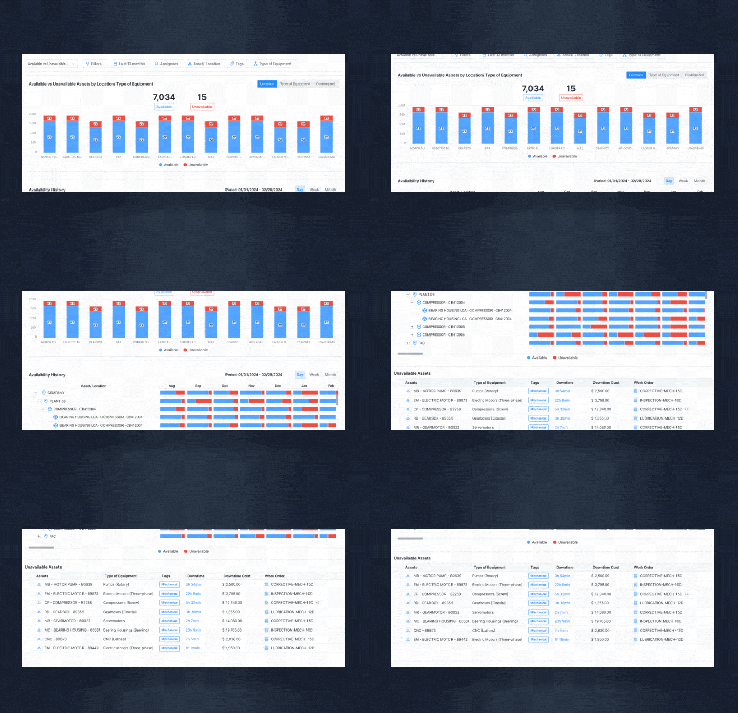
The new report presents an intuitive chart that juxtaposes available and unavailable assets, giving you a clear snapshot of performance. You can customize this visualization by grouping assets according to location, equipment type, or other parameters that suit your operational structure. This flexibility ensures the data is both actionable and relevant to your unique requirements.
Historical Data and Performance Tracking
Take your analysis further with the Equipment Availability History feature. This tool offers a balanced view of available versus unavailable hours, while allowing you to filter results by day, week, or month. To provide additional context, you can review Work Orders linked to specific assets and evaluate the associated unavailability costs. This comprehensive approach connects downtime events to their financial impact, enabling you to prioritize actions effectively.
Granular Analysis for Smarter Decisions
For a deeper dive into your asset data, the table view delivers detailed information on each unavailable asset, including its downtime duration and financial impact. This granular level of detail allows you to pinpoint costly disruptions and allocate resources strategically, helping you minimize downtime and enhance overall efficiency.

The updated Availability Report goes beyond tracking uptime by offering a complete perspective on how unavailability impacts operations. You’ll gain a clearer understanding of availability trends, the costs associated with unavailability, and how Work Order efficiency is influenced by asset downtime. This comprehensive view empowers your team to identify and address operational issues more quickly, optimize maintenance planning, and ensure continuous asset availability.
